Formula 1 grand prix visualisation
Formula 1 grand prix visualisation
4th May 2023 ~ Dion Pinto
Introduction
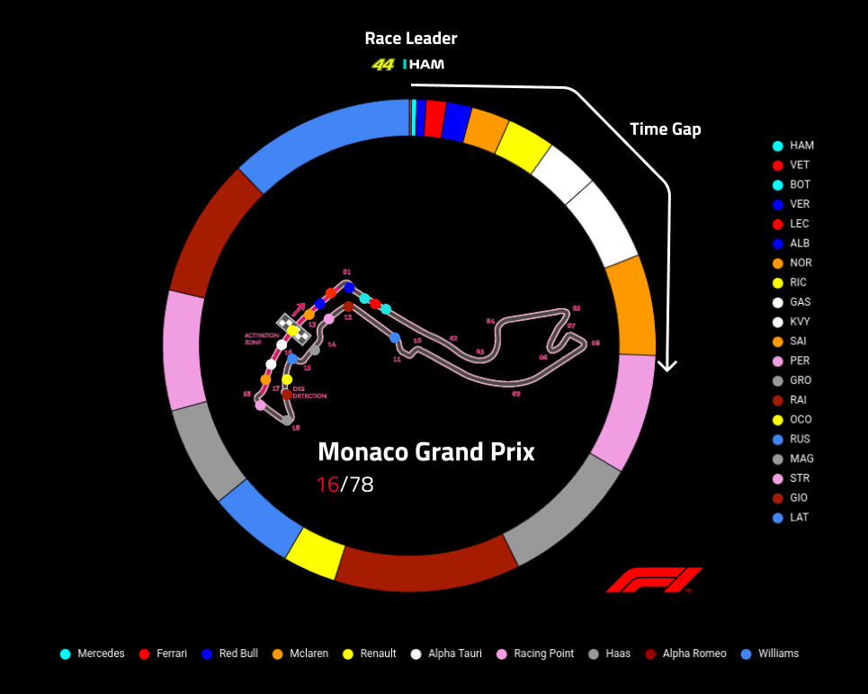
The visualisation shown is a dynamic/interactive chart representing the current state of a formula 1 grand prix (A demonstration of the Monaco grand prix is shown).
➔ The outer ring indicates the time gap from the current race leader (In this case Lewis Hamilton) with the color indicating the team.
➔ The inner map is the circuit at which the current grand prix is conducted. Each driver is represented as a colored plot, with the color indicating the team they race for.
➔ The key at the right side of the chart indicates the driver's race abbreviations and their current race position. The key at the bottom is the F1 race teams.
➔ The topmost part of the chart indicates the current race leader and the white line represents the direction of flow for the time gap metric (clockwise) and the number in red indicates the current race lap.
Demo